
How to make a good Web design
The evolution of web design
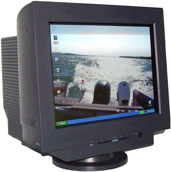
In the old days, people only have small and big monitor like this.
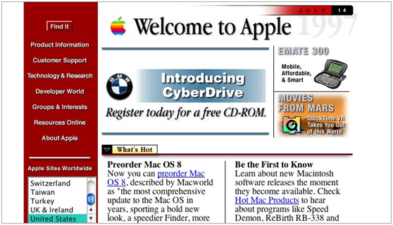
The screen width is 1024 px at maximum. At the time website designer tend to put their whole website to the left and set the maximum with to 800 px and put the menu bar to the left. People like to put some flash animation at the beginning as well because flash is the only tools that can make the website “animated” at the time. The other advantage to flash is it supports vector graphic that dramatically reduce the image size.
The drawback to flash is it sucks up a lot of CPU power. That is why iPhone firstly refuse to support flash. Therefore, new technology emerge, New browser and new HTML standard helps web designers to build more compact website.
What is HTML5 CSS3
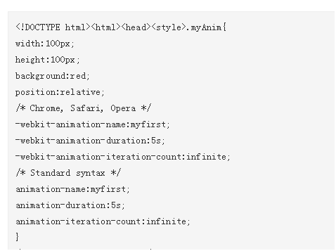
Html was widely used at 1995. The CPU and browser technology has been enhance greatly however, it has not been any big changes until the version 5 (published at 2014). One of the most enhancement to HTML5 is it support animation and mobile phone widely welcome HTML5. Below is a fragment to HTML5 CSS3 animation.
What are the requirements to the modern website
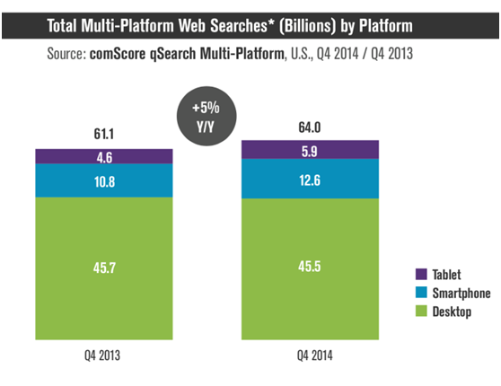
Google Says More Searches Now On Mobile Than On Desktop. It is very import to support mobile phone.
The key difference between desktop and mobile are the shape of the screen. Mobile screen is long and narrow while desktop screen is wide and short. Now a days there some wider screen that has 2000+px. As a result the layout of the modern website should have the following key factors.
- Accessibility ( The website can read by as many devices as possible)
- Content rich (More text and article make your website rank higher in the search engine)
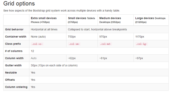
Instead of making many version of the website, we should make one flexible web design that fits all screens. This is called responsive web design. It automatically support all screen size. There are many responsive web design frame available. The one Embraiz is using is call “Bootstrap”. By default it supports 4 different screen sizes
Sometimes our customers like the fix the height to website home page. ” I don’t like scrolling” They say. However, if you consider the various screen size especially for mobile phone. The front page highlighted information can’t pack into one single page without scroll at all devices. Nonetheless people are used to vertical scrolling.